OpenBoxDesign business stationery
We like to keep things simple here at OBDHQ and our identity reflects this. Keeping things simple enables us to play – to elaborate and to experiment. Our identity has gone through various colour combinations (it was designed that way) but has never really changed as it works well for us. Here’s just a little of how we use it.


An interesting calling card
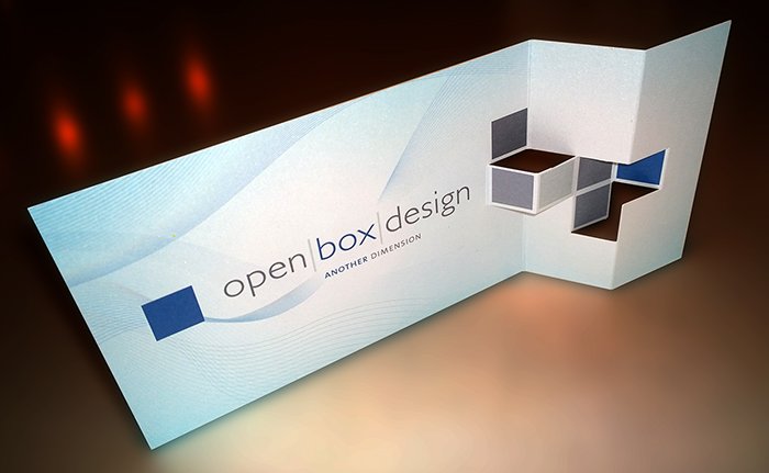
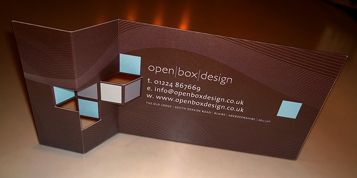
We like to play and here’s something that shows this well. We’ve taken our identity and made it three dimensional; but not in a typical way. The calling card becomes a talking point and has often been the leader into conversations about design. It also serves an engineering purpose. The folds in the card a rigid – meaning the card stands up – and how better to attract a prospective client than have a calling card that stands above everyone else’s?

Business Cards
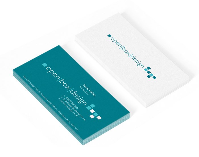
This year we have changed our colour scheme – still cooling but we’ve gone a little greener. Having a strong back colour attracts – as does the slightly opalescent paper stock we use. The details are clear and clean and easily accessible – perfect for when you have a design emergency and need our services.

Letterhead
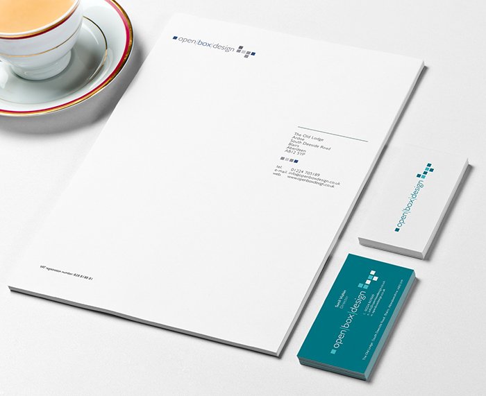
It’s simple, and it works. As with all letterheads, they need to have clear space for letter writing and remain balanced. this one does simply and effectively.
Cup of tea optional.