The Barn
‘The Barn’ is the term that most people use when referring to Woodend Barn.
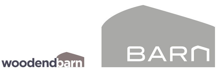
We had been using the existing logo, which mentions the name in full for a couple of years. In fact, the old logo was the starting point for the overarching concept of the colour ‘shoulder’ we use in most of the design work for the Barn.
However, there was a general consensus that the old logo didn’t fit the ethos, message or plans that the Barn had moving forward. In short, the old logo didn’t tell the story of the Barn.

The existing logo
The existing logo served the Barn well for a number of years but was seen to be passive – the typeface used was so generic that it felt like it could be for anything and didn’t reflect the ethos of the Barn. It also proved to be difficult to use in many circumstances; being too long in comparison with other logos and having two shades of grey meant that it didn’t play well when used on many backgrounds where colour and tone was important. However, the shape – that of the building profile – was, and is, unique.
Process
We had a number of informal discussions with various staff members and the board to ascertain their own feelings on the direction to take. Overwhelmingly, the consensus was to be ambitious, positive and challenging. It was also felt that Woodend Barn had by default, changed to the Barn, as that is how it was expressed on a day to day basis.
Solution
Keep the shape, reflect the shape and the contemporaries of the Barn in the typeface and how it is used.
The logo is now bold, contemporary and is ambitious in it’s outlook. It stands proud and positive. The notion of the Barn being an open door into the possibilities of the arts is reflected in how the ‘n’ is represented (reiterating the background shape) and also by how the entire typeface is punched through the shape. Unlike the old logo where it was tricky to sit it in front of many colours and images, this one is meant to sit over and show through what lies within.
Generally, the Barn identity is used in the white form, but can change to any tone. We use it in warm grey on a white background and when the background colour is too light for the logo to show, we overtint the logo so that it still compliments the background.
The Barn
The Barn is the largest multi-arts venue in the North East of Scotland. The emphasis is on ‘the arts’ in a very open sense. As you can see from much of the design work we do for the Barn, the team cover a huge array of events, workshops, exhibitions and screenings ranging from the commercial to the conceptual, and much in between.

